4 Physical Therapy Clinic Design Layout Tips
Want to make the most of your physical therapy layout in order to maximize growth and improve patient benefits?
Whether you’re getting ready to launch your own physical therapy business or looking for new ways to heighten the standard of care at your practice, our team is happy to share some physical therapy layout best practices we’ve acquired from operating several successful private practices and coaching PT owners like yourself on various ways to optimize your space and add rocket fuel to your revenue.
If you missed it: We’ve shared the physical therapy technology setup that improves your clinic design as well as why size matters in your clinic design.
These five physical therapy layout tips will help you design the perfect physical therapy clinic design so your patients and team are excited to walk in the door every time.
Our Most Popular Physical Therapy Clinic Layout Tips
1. Keep Shifts in Mind to Offer More Options for Care
A physical therapy clinic design layout that accounts for hours outside of 9-5 will show patients you’re serious about offering care even if they can’t get away from other obligations during the day. Sure, you’ll require more staff to cover the shifts, but you’ll also have more grateful patients to keep them busy.
When thinking about how to design a physical therapy practice to accommodate this, especially if you’re working with a smaller square footage, it’s the most practical way to serve more clients.
Quick Tips for Shift-based PT Clinic Design:
- Use lighting that mimics daylight. Clients who feel sleepy from their surroundings will not feel as motivated to participate in their therapy as wakeful ones.
- Use interior rooms for the evening shifts and transitions as windows would be dark anyhow.
Keep in mind: If you plan on offering cash-based physical therapy services, you must be even more flexible with appointment times even offering same day first visit appointments!
2. Opt For an Open Floor Plan
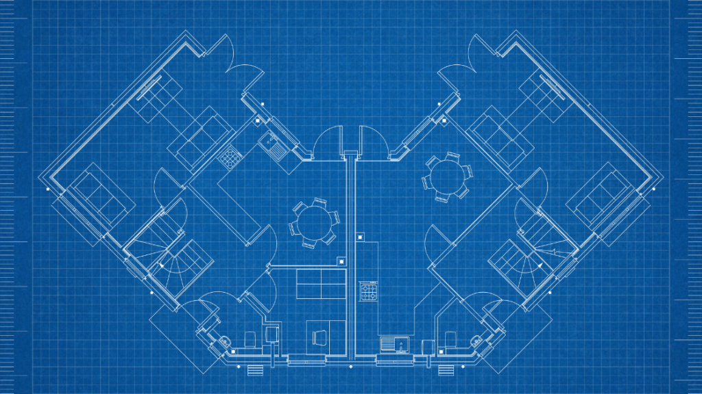
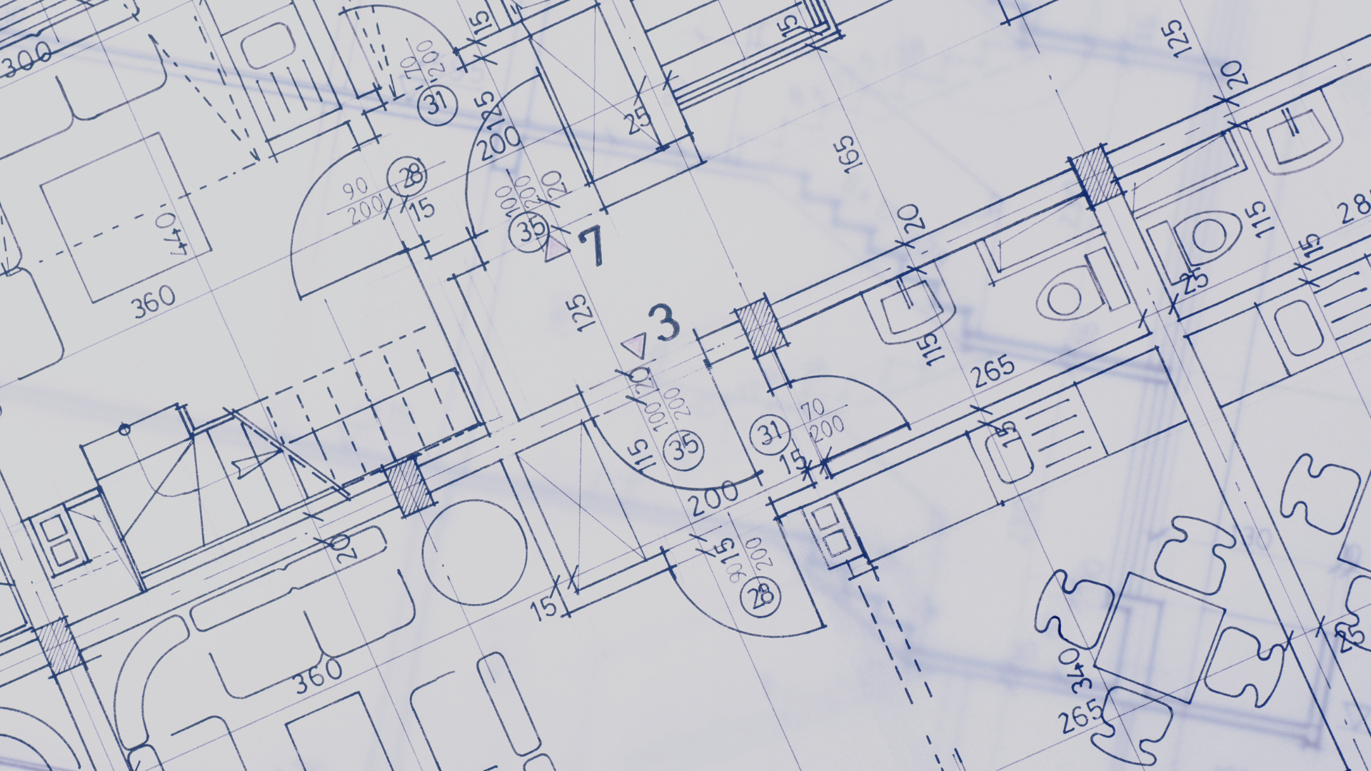
Keep your physical therapy floor plan mostly open to help staff learn from each other, to help patients be inspired by one another and to create a sense of community much more easily than a partitioned space.
You’ll still want to have some private rooms and tech suites for the patients who are more privacy-conscious or need it, but keeping most of your space open will help you maximize treatment space and minimize barriers.
3. Use a Shared Prep Area
If you keep your floor plan open, this makes even more sense!
Not only will you require fewer charting and prep areas by creating a more central location, but you’ll also increase the speed of service and cut down on the steps your staff needs to take per patient. Your team will appreciate these little conveniences.
4. Bring Your Staff Room Forward
No one likes to be relegated to a dingy back room, so moving your staff room to the front of your reception area has many perks. Moving this room forward will give your administrative staff better access to their team to problem solve and serve patients more efficiently.
Making their lives a little easier will undoubtedly contribute to happier voices on the phone and a more positive atmosphere and culture overall.
Design a Better Physical Therapy Space With This Guide
If you’d like more information on how to design the perfect physical therapy layout, you can download our free guide, The Physical Therapy Owner’s Clinic Design of the Future. We cover expert tips from Jason Waz, NeuPTtech’s founder and Director of Physical Therapy at Neufit.
Also, if you’d like to talk with an expert on physical therapy practice design, you can request a one-on-one consultation with Jason – just download our clinic design guide to learn more!

 Previous Post
 Next Post


